Get started  
Login  

Help Center

Community / Forum Ask Zappter Support We build your app Marketplace

Documentation

English

General

Videos

Mastering the content editor Pixel perfect design Setup your E-Commerce Store Configure your booking engine Event-System / Drop-In

Popular

App Store Submission Creating Push Notifications Typography Changing template Changing Rules

Business Modules

New

More Tutorials

Documentation

Configuring Custom Fields

Configuring custom fields

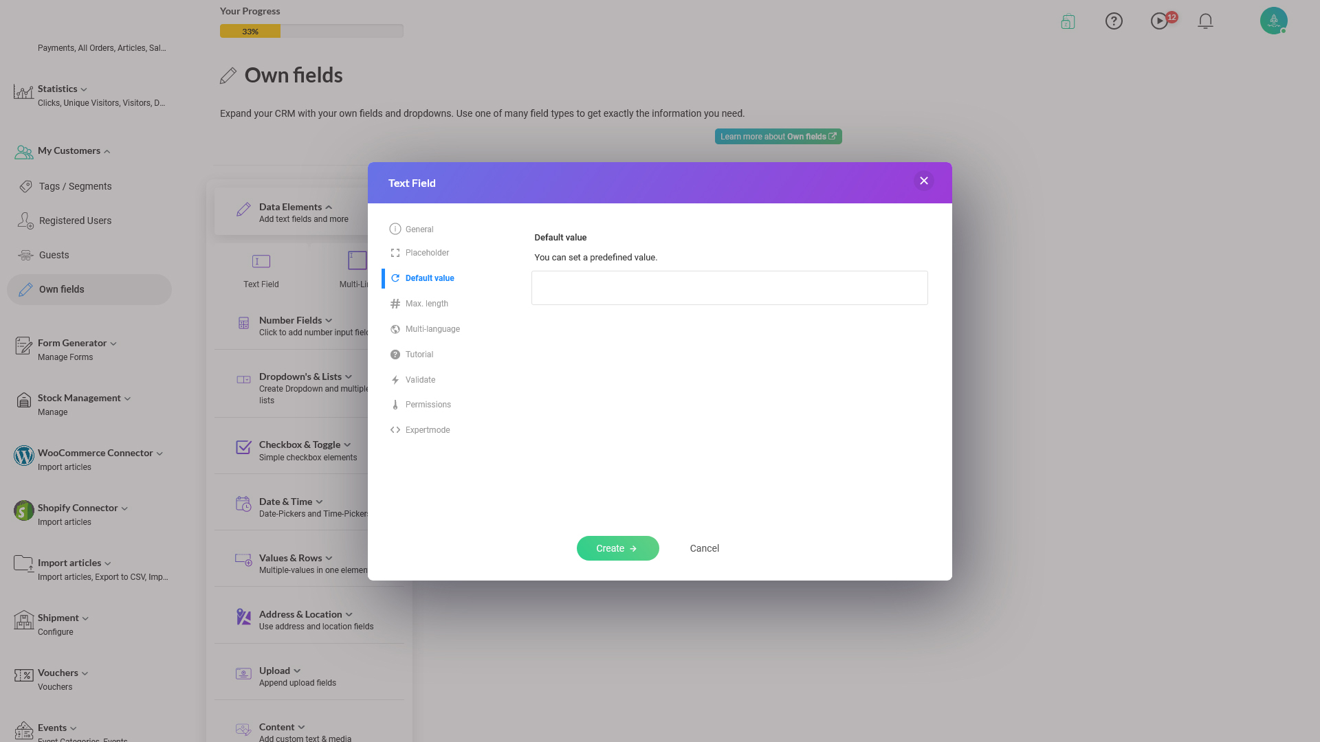
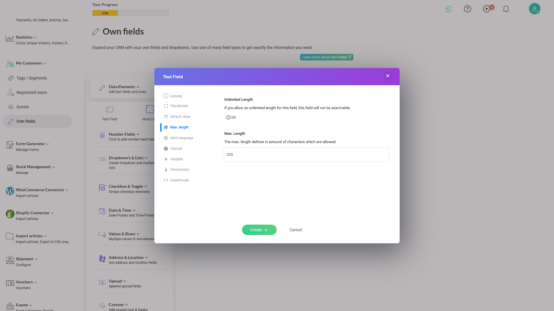
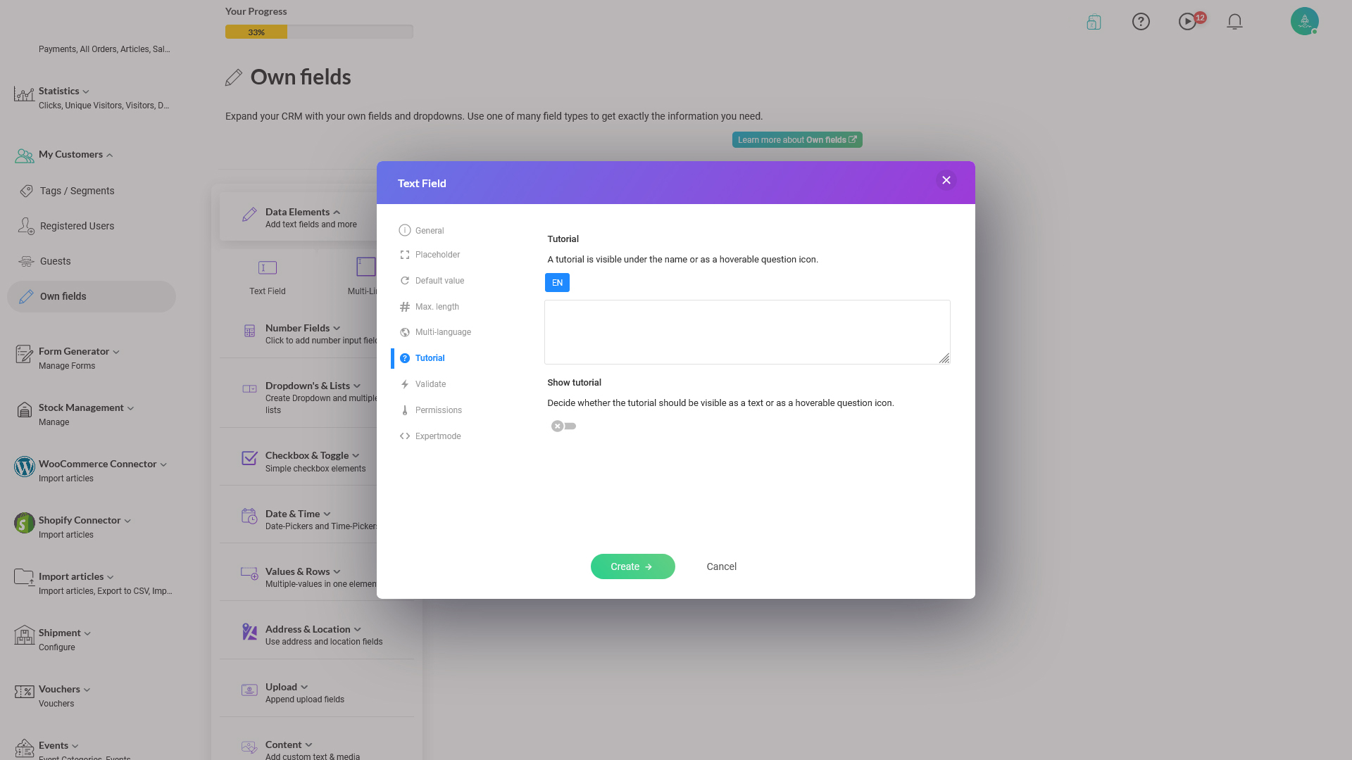
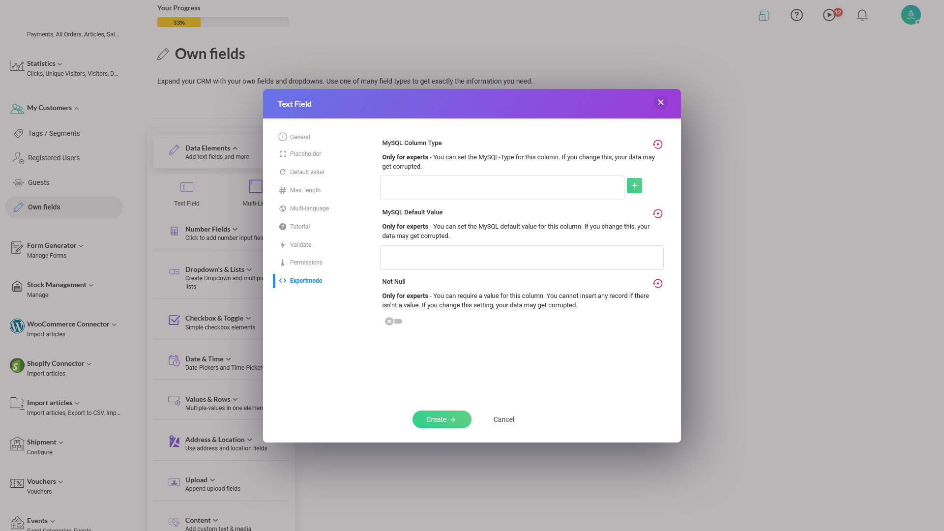
As soon as you have created a Custom Field, your next task is to configure its characteristics such as it's length, data validation, value dependency, default values, associated icon, and other constraints as you're going to read below.

This document explains:

  1. Each attribute you can set on a field
  2. What field type the attribute applies
  3. Description of attribute
When you create a Custom Field by going to Admin > CRM Customers > Own Fields > [select to add a field], the below field configuration screen comes:
Depending on the field you select to add, there can be different tabs you get to configure. This document explains each tab's functionalities and for which field type the tab applies to.
General tab:
image.png 133.84 KB
Options on the tab:

  • Name: the name of the custom field
  • Unique ID: System assigned ID. Leave as default
  • Internal Note: Internal note for other admin users to know why the field is created or similar reasons
  • Required: Make the entry mandatory in this field
  • Hide: Hide the field
  • Show on sign up page: When you enable this tick, the field is shown on the user registration page. Also, read the section, Custom Fields and Sign-up Page for example configuration on it
Applies to these field types:

  • Data Elements > Text Field
  • Data Elements > Multi-Line
  • Number Fields > Number Field
  • Number Fields > Payment
  • Dropdown's & Lists > Dropdown
  • Dropdown's & Lists > List
  • Dropdown's & Lists > Grid
  • Checkbox & Toggle > Checkbox
  • Date & Time > Date
  • Date & Time > Time
  • Date & Time > Date & Time 
  • Date & Time > Birthday
  • Values & Rows > Rows
  • Values & Rows > Json
  • Upload > Custom
  • Upload > Documents
  • Upload > Images
  • Upload > Crop 
  • Upload > Videos
  • Upload > Archives
  • Content > Text
  • Content > Picture
  • Others > Password Field
  • Others > Color Picker
  • Others > Signature
  • Others > Hidden Field
Placeholder tab:
image.png 390.97 KB
Options on the tab:

  • Placeholder: This is the default or placeholder text displayed to user by default on this field
Applies to these field types:
 
  • Data Elements > Text Field
  • Data Elements > Multi-Line
  • Number Fields > Number Field
  • Number Fields > Payment
Default Value tab:
image.png 389.72 KB
 
Options on the tab:

  • Placeholder: This is the default or placeholder text displayed to user by default on this field 
Applies to these field types:
 
  • Data Elements > Text Field
  • Data Elements > Multi-Line
  • Number Fields > Number Field
  • Number Fields > Payment
  • Checkbox & Toggle > Checkbox
 
Max. length tab:
image.png 400.87 KB
Options on the tab:

  • Unlimited Length: Make the entry length unlimited
  • Max. Length: Limit the user data entry to certain number of chars
Applies to these field types:
 
  • Data Elements > Text Field
  • Data Elements > Multi-Line
  • Number Fields >  Number Field
  • Number Fields > Payment
Multi-language tab:
image.png 392.82 KB
 Options on the tab:

  • Multi-language: If the field is available for different languages that your app uses, so the users can enter in other supported languages
Applies to these field types:
 
  • Data Elements > Text Field
  • Data Elements > Multi-Line
Tutorial tab:
image.png 405.71 KB
Options on the tab:

  • Tutorial: Little more info about the field is displayed when the user hovers over the field
  • Show tutorial: Whether to show the above text or not
 Applies to these field types:
 
  • Data Elements > Text Field
  • Data Elements > Multi-Line
  • Number Fields >  Number Field
  • Number Fields > Payment
  • Dropdown's & Lists > Dropdown
  • Dropdown's & Lists > List
  • Dropdown's & Lists > Grid
  • Checkbox & Toggle > Checkbox
  • Date & Time > Date
  • Date & Time > Time
  • Date & Time > Date & Time
  • Date & Time > Birthday
  • Values & Rows > Rows
  • Values & Rows > Json
  • Upload > Custom
  • Upload > Documents
  • Upload > Images
  • Upload > Crop
  • Upload > Videos
  • Upload > Archives
  • Content > Text
  • Content > Picture
Validate tab:
image.png 391.68 KB
Options on the tab:

  • Validate: Select a validation rule from the drop-down list and enter the preferred value in the resulting text entry below
Applies to these field types:
 
  • Data Elements > Text Field
  • Data Elements > Multi-Line
 
Permission tab:
image.png 399.62 KB
Options on the tab:

  • New: If allowed to enter new data
  • Edit: If allowed to edit the existing entry
Applies to these field types:
 
  • Data Elements > Text Field
  • Data Elements > Multi-Line
Expertmode tab:
image.png 452.28 KB


image.png 429.27 KB
Options on the tab: (This allows you to directly map the field configuration with the MySQL database table fields - Advanced users)

  • MySQL Column Type: For advanced users, who can select MySQL database column types to associate with this field
  • MySQL Default Value: Default values possible by the MySQL database 
  • Not Null: If null values allowed as per MySQL database
Applies to these field types:
 
  • Data Elements > Text Field
  • Data Elements > Multi-Line