When you build your app with Zappter, the UI is clean, sleek, professional, and distinctive. But when you need to own a design that speaks your brand-language or want to be completely unique among others, Zappter has a tool to do that task, the Designer.
Design editor
Admin > Customize > Content. Click to edit the app. Once in, select the Design icon.
1.jpg311.39 KB
Designer opens the content populated with Zappter standard UI elements or the UI elements of the selected template of your app without any design customizations.
2.jpg477.8 KB
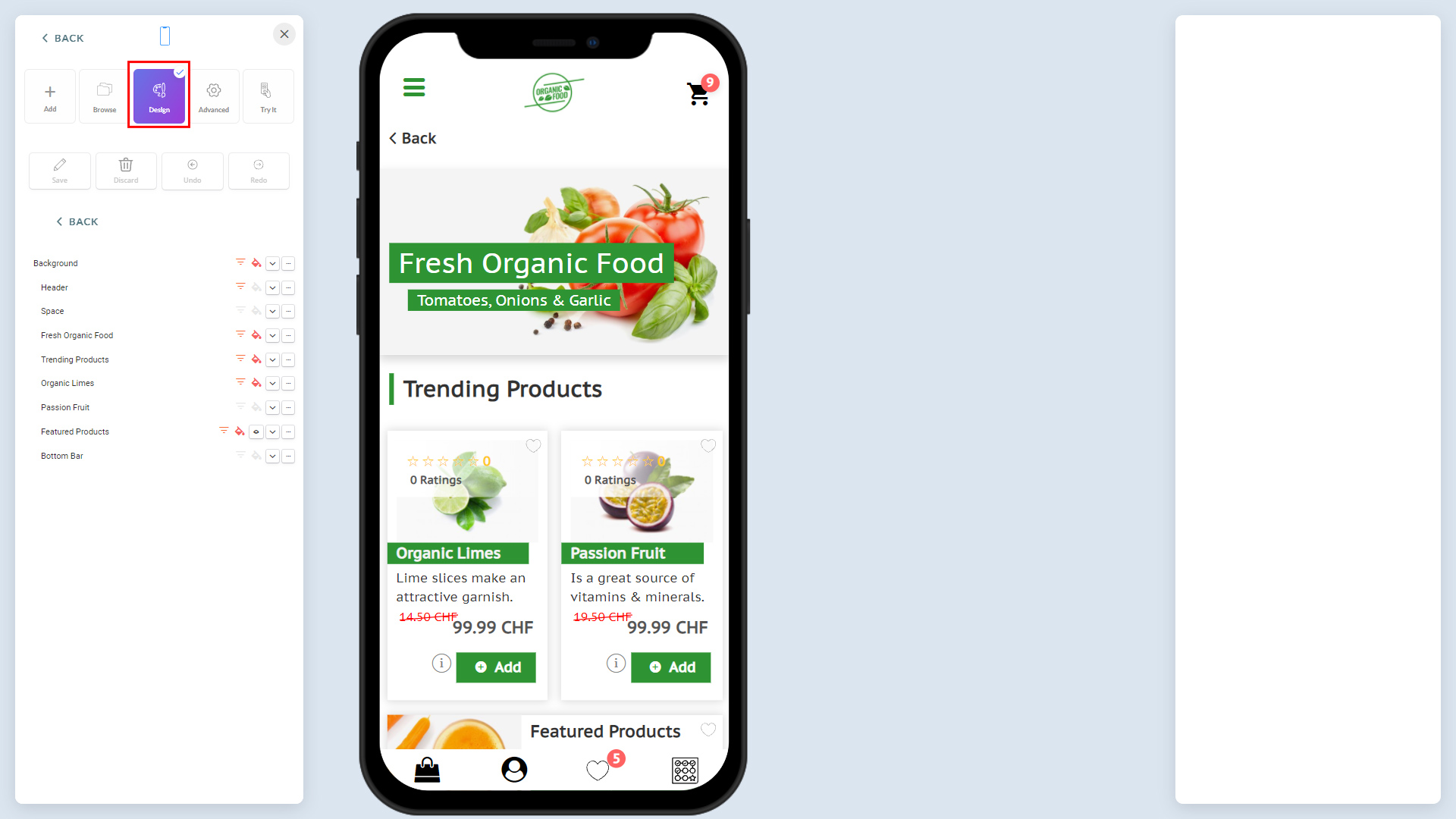
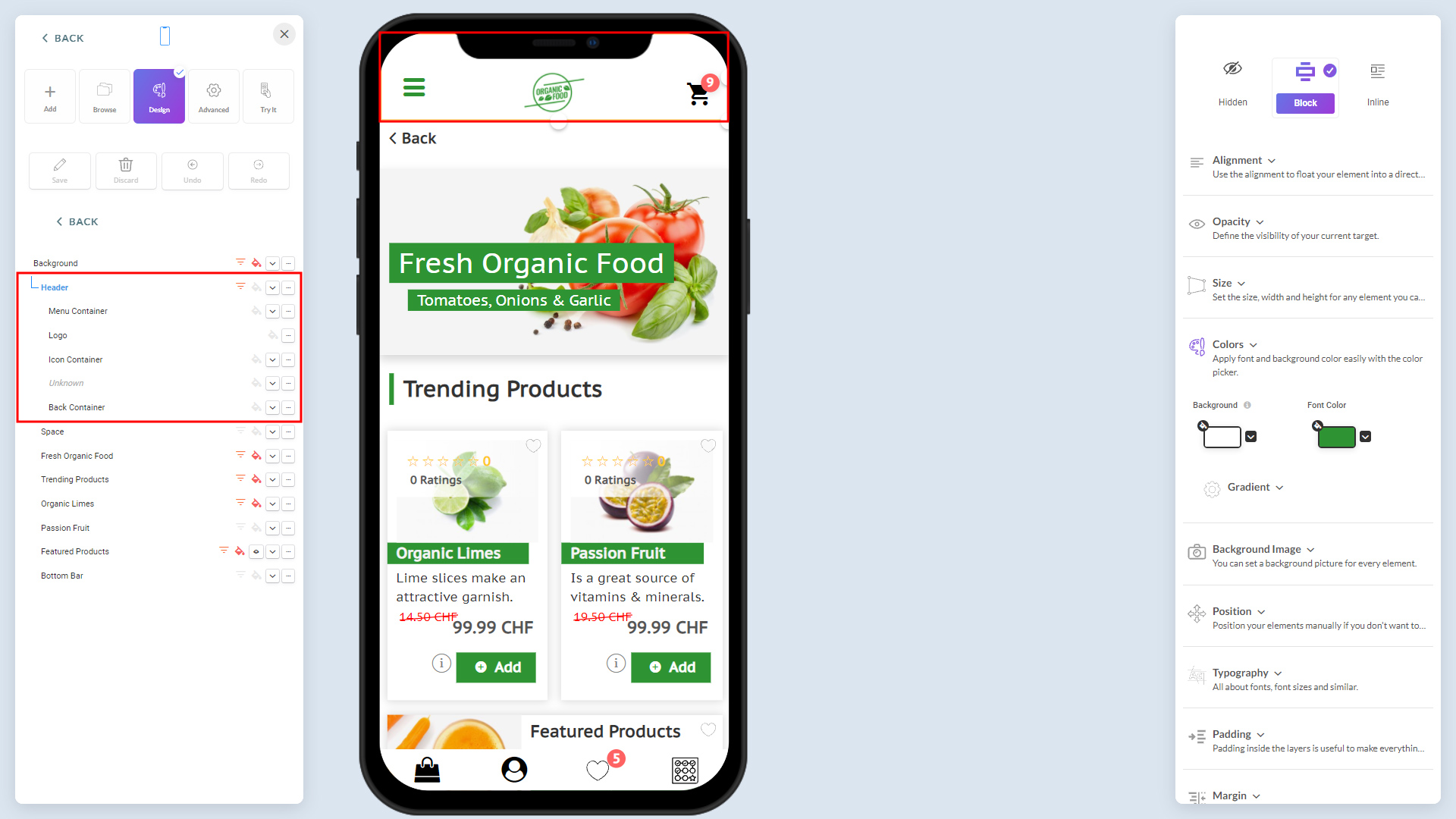
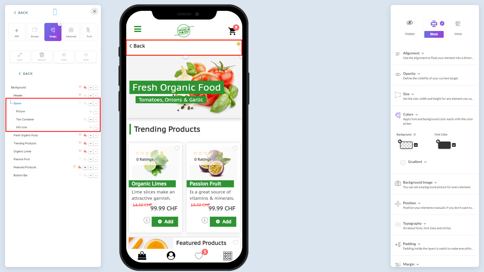
Layers & Explorer (on left): Represents each UI element of the app. The UI elements, Background, Header, Space, and Bottom Bar are common and mandatory. Others are those you have put onto your content to your needs such as e-commerce, category, etc.
Style properties (on right): Here is where you set/customize the styling (CSS) of the UI element selected in the Layers & Explorer
Did you know that you can also use right-clicks while customizing? To quicken your tasks, take advantage of right-click context menu options throughout the Designer.
3.jpg480.78 KB
Layers & explorer
This represents each UI element of the screen. It represents two types of elements, 1) Common elements 2) Elements from your current design.
Common elements: Background, Header, Space, Bottom bar, because these are available for any design (mandatory)
Other elements: UIs such as your e-commerce, bookings, texts, or anything you have put on your content to satisfy your requirement.
UI elements get highlighted as you hover the mouse on them. Below are common UI elements discussed above:
Background & Header:
5.jpg433.6 KB
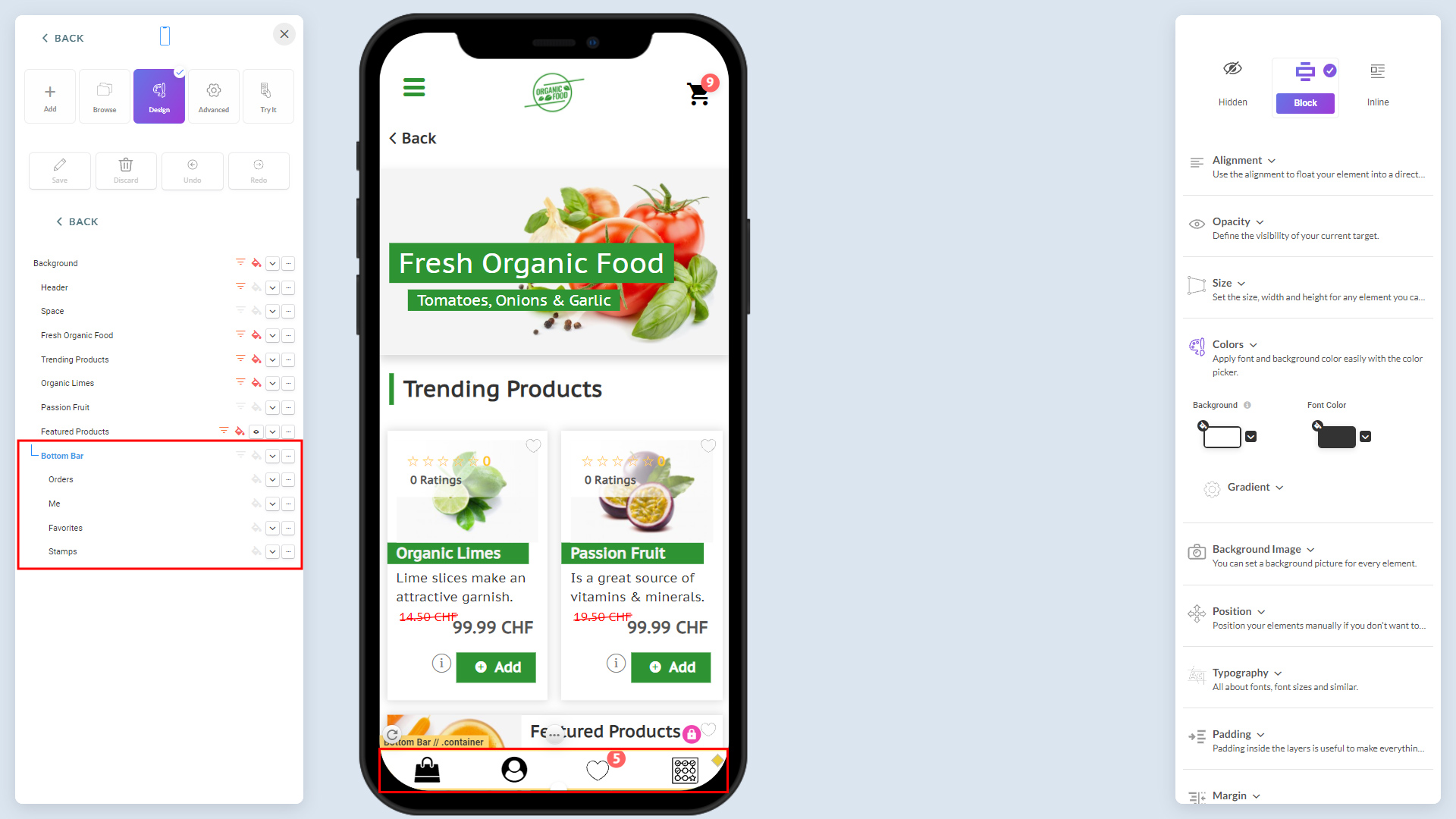
Space & Bottom Bar:
6.jpg426.44 KB
7.jpg424.57 KB
You can change the colors & fonts or any other attribute of any elements in the style properties. However, avoid using style properties to change the common UI elements' Colors & Fonts here, and follow the appropriate options discussed in the Header, Background, Bottom Bar sections. It helps to change them dynamically at any time without going through redesigning or using UI customization.
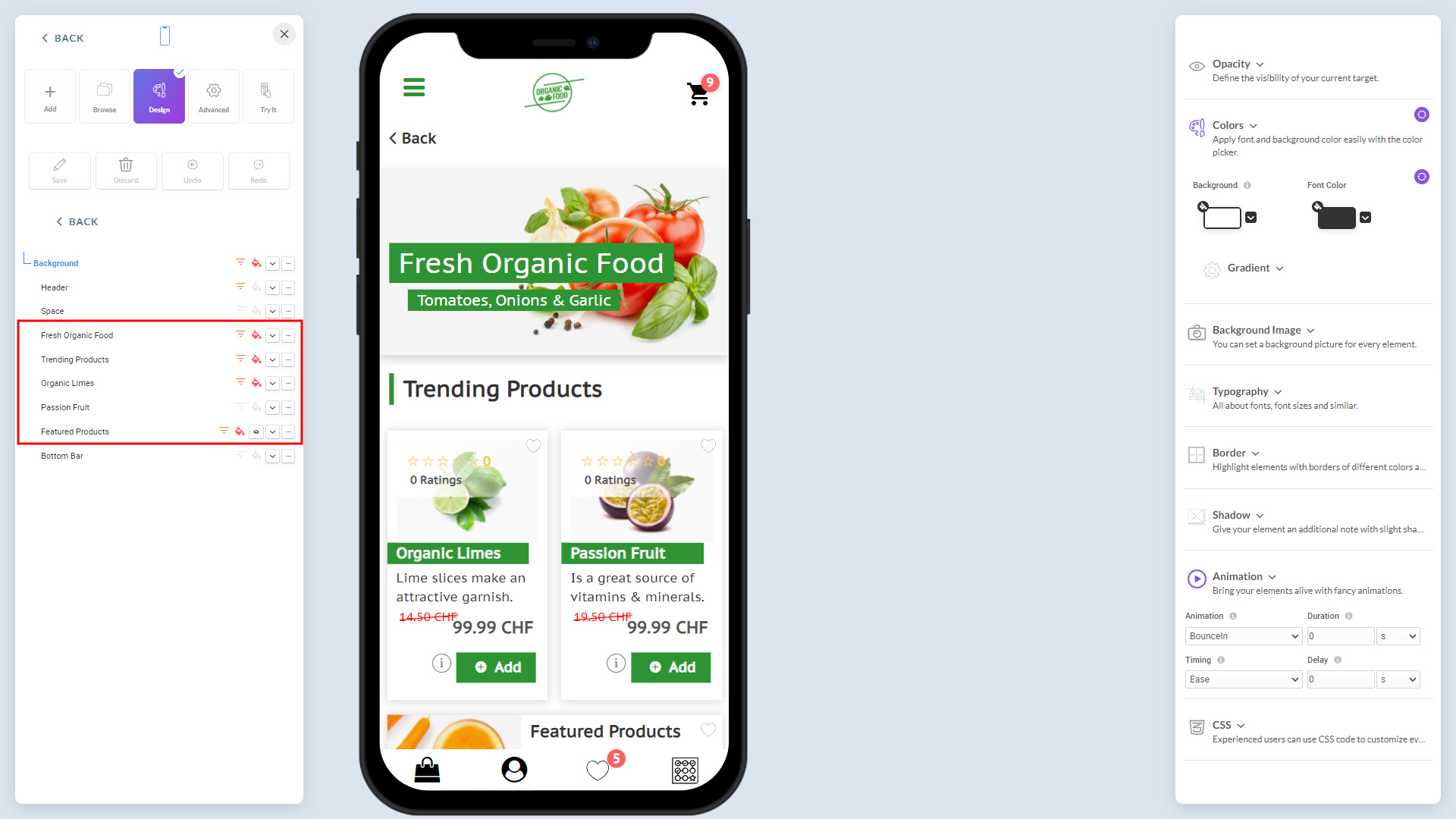
The other four UI elements marked below are, Featured Products, Organic Limes, Passion Fruits, and -these are user-created content to the needs.
8.jpg417.36 KB
Steps to customize a UI element
Below, a standard UI of an 'article' UI element, highlighted in Layers & Explorer for further understanding of four crucial steps involved in the customization:
9.jpg414.8 KB
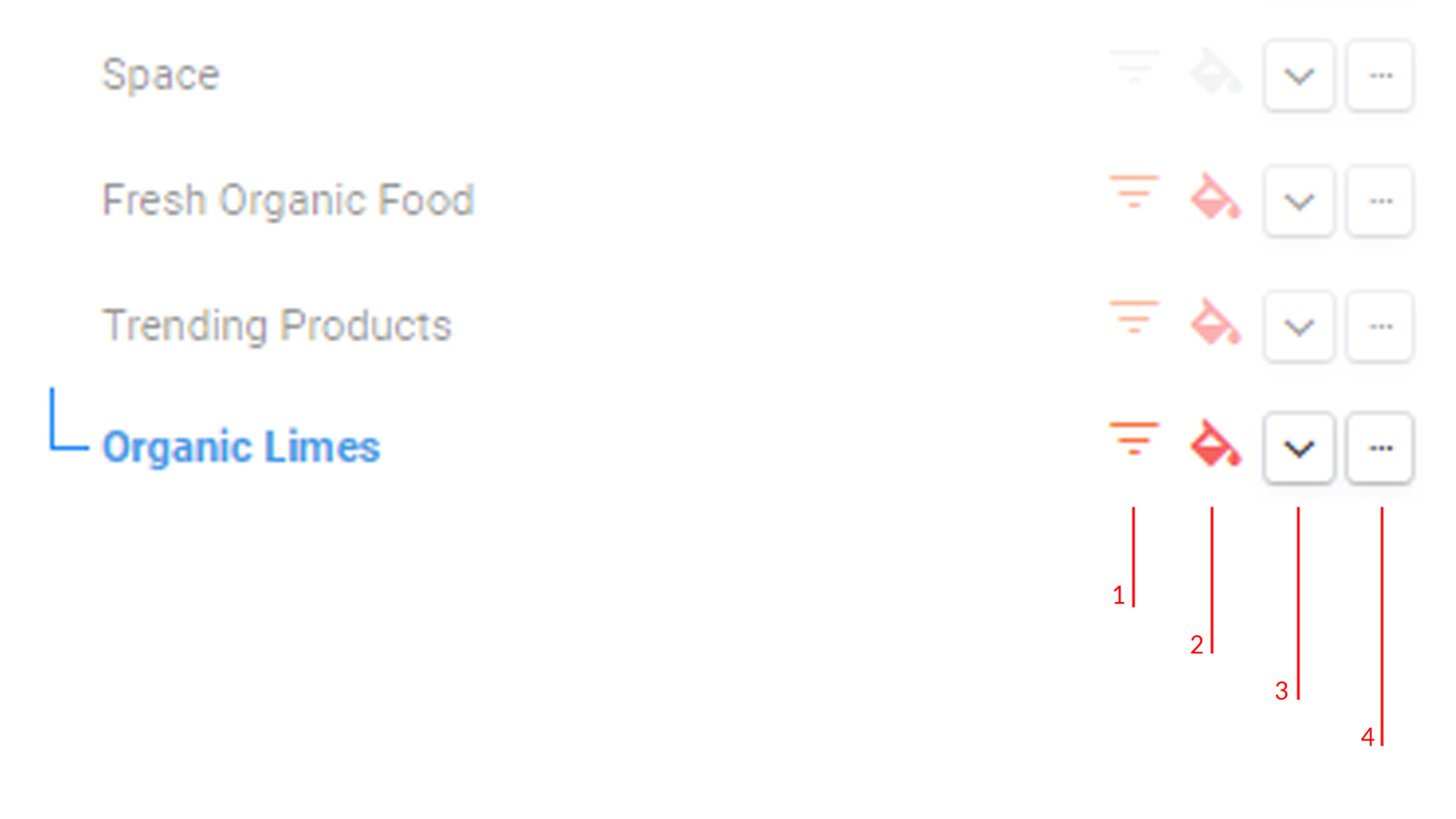
1. Set on the inheritance for the UI element. Organic Limes in this sample.
10.jpg103.33 KB
1. Inheritance: When you customize a UI element, say article, for instance; you want to make sure that all article UIs in the future will look like the one you customize. This is achieved by marking it with "inheritance" on (when the tiny pyramid-like button is yellow, meaning "inheritance" in on. When it's grey, you haven't enabled inheritance)
2. CSS Change: Change CSS or indicates any changed styling (CSS)
3.Expand button: Expands the UI element to reveal each of the objects inside it
4. Opens context menu: Explained below
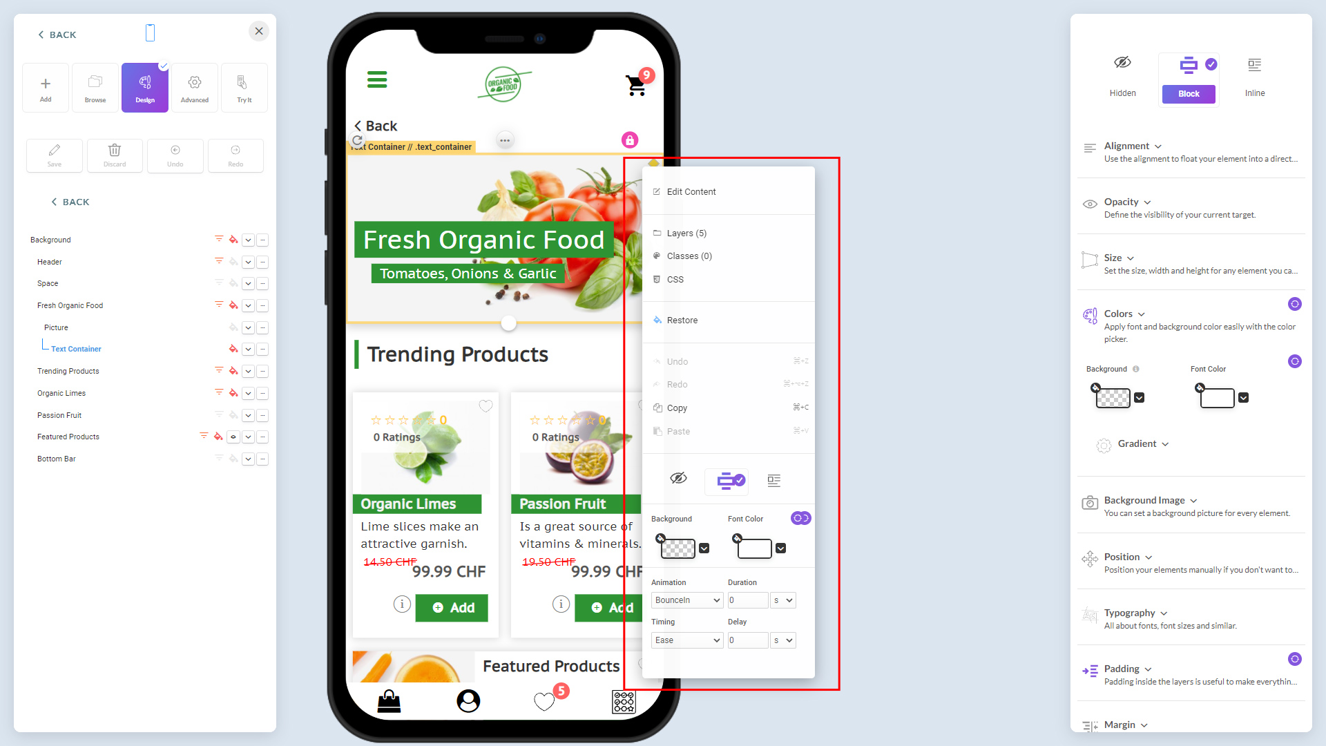
Context Menu Options:
Edit Content: Opens or takes you to the content editor screen
Layers: This shows the number of layers (basic objects) making this parent object with the clickable list. When you click on an object, it takes you to styling of that particular object. For example, if you click on the 'Contact us' parent object, it shows all objects, including text and the button. If you want to change the button color, you can directly click on it to get into the button's styling to change whatever you want to change there.
Classes: When you have customized a parent object, you can make it a 'class' by clicking on the 'New Class' option. Or, if you want to make any single element inside the parent object a class, you can click on 'New Element Class.' Later on, if you want to make another parent object or a single element to look like a class you created earlier, you can simply click on the saved classes displayed as options to apply the same changes. (When you click on this option, it shows these options: New Class & New Element, and all classes you have already created.)
Enable Inheritance: As discussed above inheritance
Favorite: Add to favorite
Undo: Undo the recent change
Redo: Redo the last change
Copy: Copy element styling
Paste: Paste the copied element styling
2. Expand the parent UI element using the 'Expand' button, and you will see all child UI elemtns that make up this single UI element, the article in this sample case.
11.jpg438.74 KB
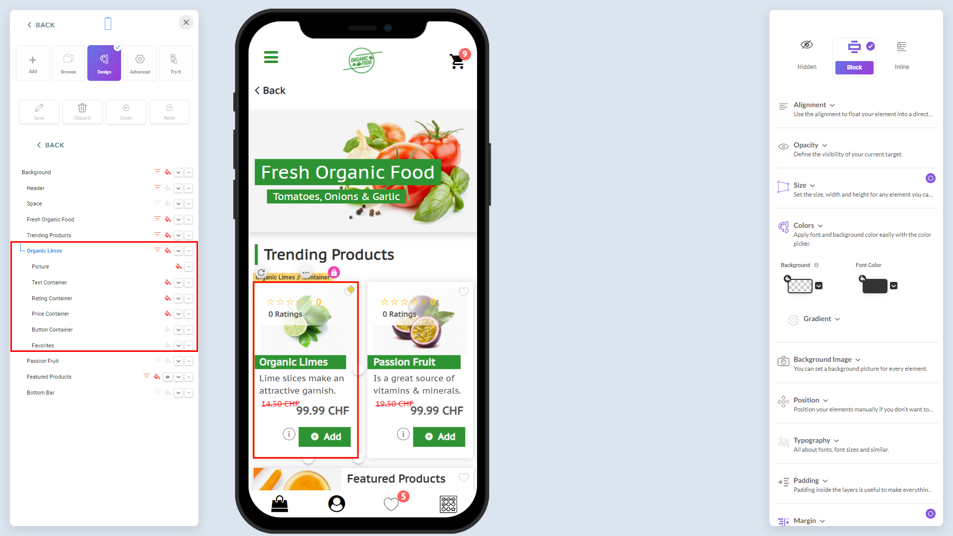
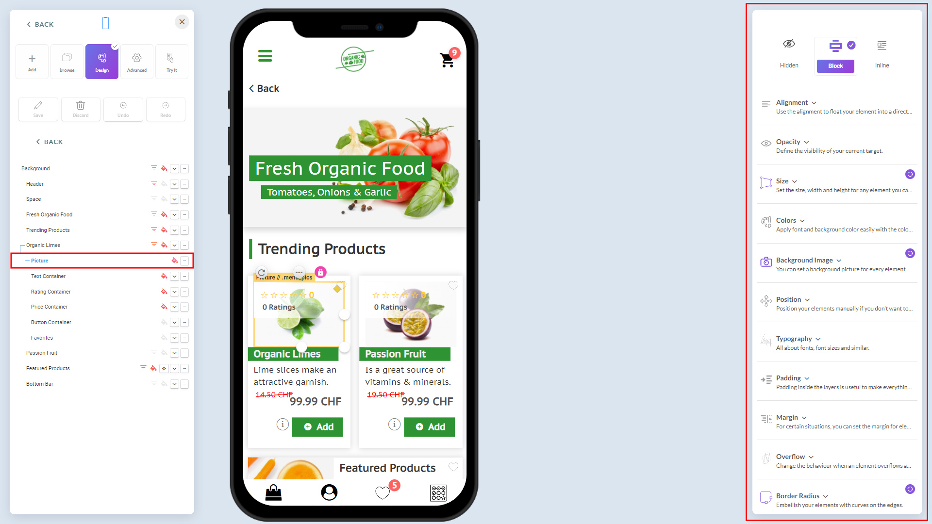
3. Change the style properties of any elements by highlighting it and setting the style on the right. In the below sample, 'picture' is a child UI element of parent element, Organic Limes.
12.jpg474.6 KB
To customize the objects, see the section, UI Style Properties that explains more on styling properties.
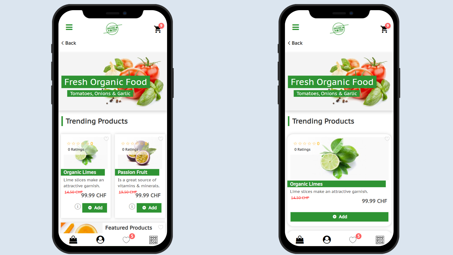
Example: Below is a simple style changes applied to change standard UI of the 'article' to customized design:
13.jpg399.66 KB
width 96%
border radius 20px
picture height 160
button width 100%
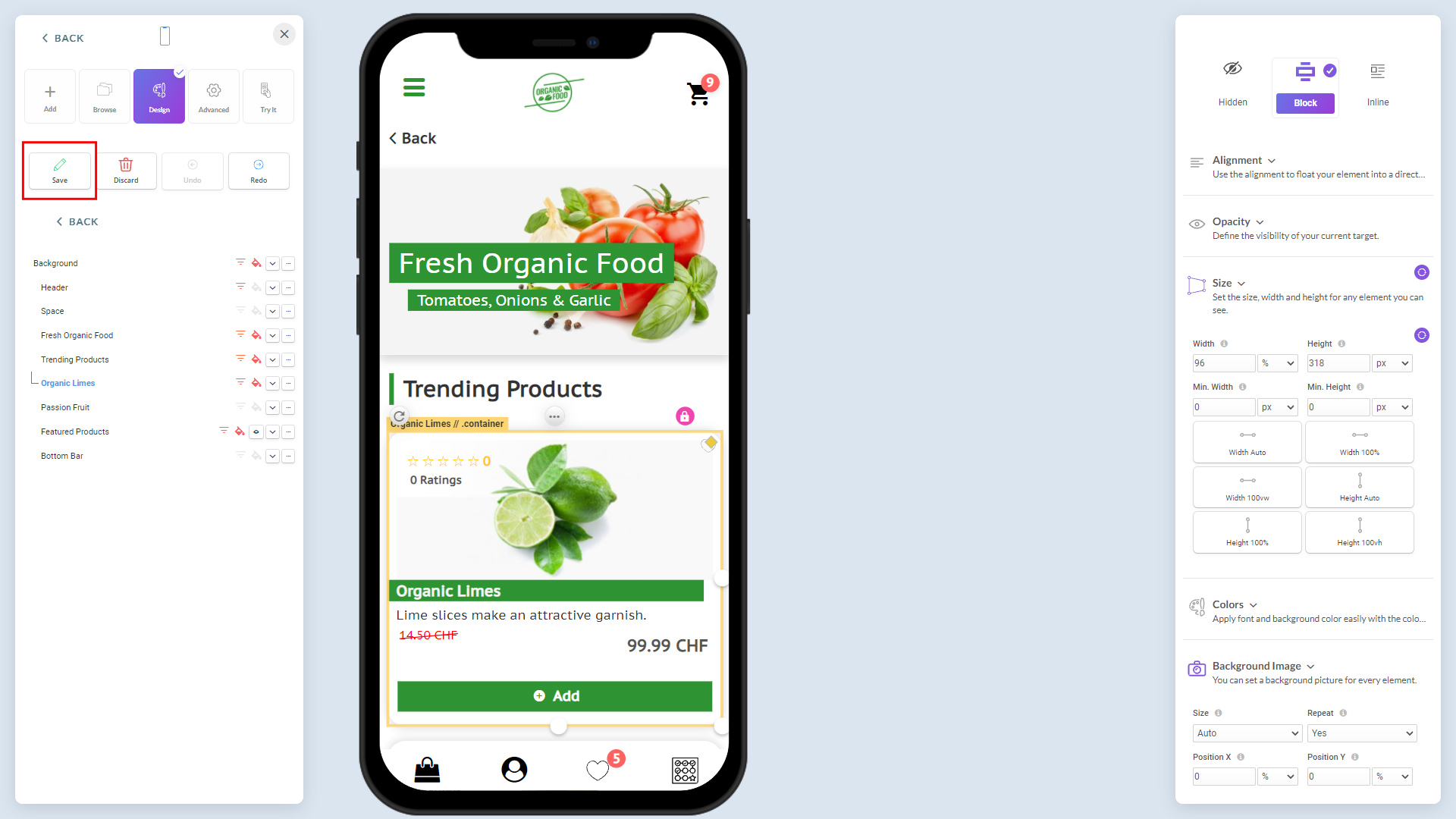
4. When you're done with style customization, save changes. From here onward, whenever you add the UI element (article in our example) on your content, it will have a customized UI because of inheritance; it is to make sure consistency throughout the app.
14.jpg392.09 KB
UI style properties
This section is about using Zappter Designer to set CSS style attributes. If you're familiar with CSS styling, you may skip this section.
To simplify understanding, a few properties at a time are discussed, and then the next few.
15.jpg148 KB
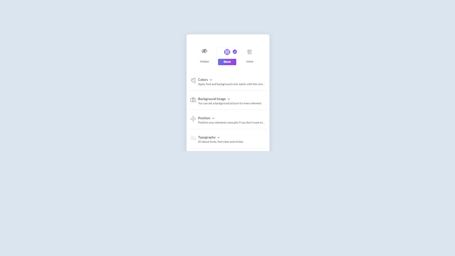
The Layout - Hidden, Block, Inline: Keep as defaults
Alignment: Alignment of the selected object within its parent container
Opacity: Visibility
Size: The width and the height of the selected object within its parent container. Default is 50px for the picture of the category, for example. Below the width is set to 46% to take nearly half the size of the parent's width
But if you make 2 objects on the same row to more than 50%, it will push one of the objects below. This is because other objects within the container are also taking space
Make sure to change the widths of other objects so that all of them collectively come within 100% of the parent's width
18.jpg81.5 KB
Colors: Avoid setting colors with this option as Zappter provides a feature where you can set the colors dynamically. See the 'Colors & Font' section for more detail
Background image: Set a background image for an object, if that is applicable. Please make a note and change the below setting
Position: Position of the object in relation to its parent container
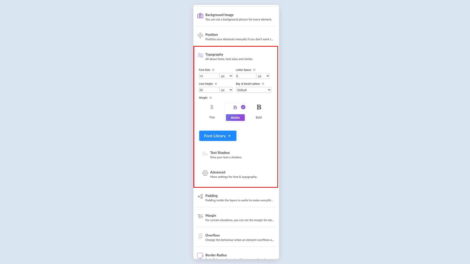
Typography: You can change the fonts dynamically with Zappter, please see the colors & font section for more detail. If you assign a font here, it won't be effective if you change them dynamically as explained in the section
image.png202.37 KB
However, you can still set the font size and the other styling here.
image.png195.51 KB
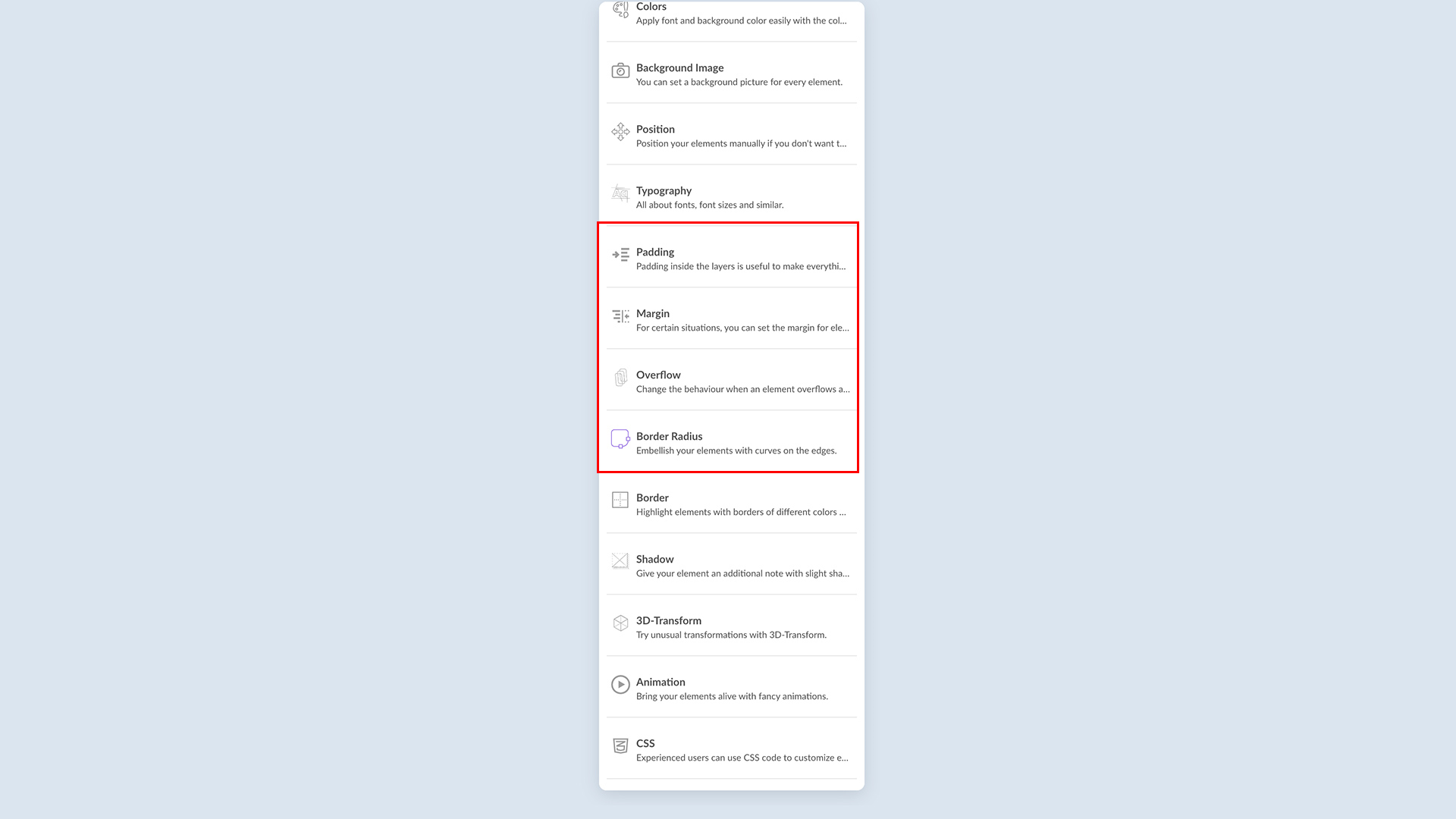
Padding: This is the space between an object's content and its border
Margin: This is the space outside of the object or it's the space in between objects
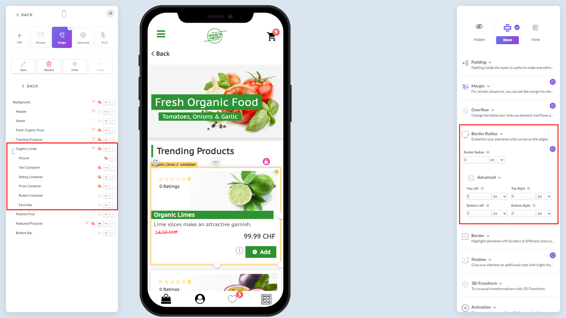
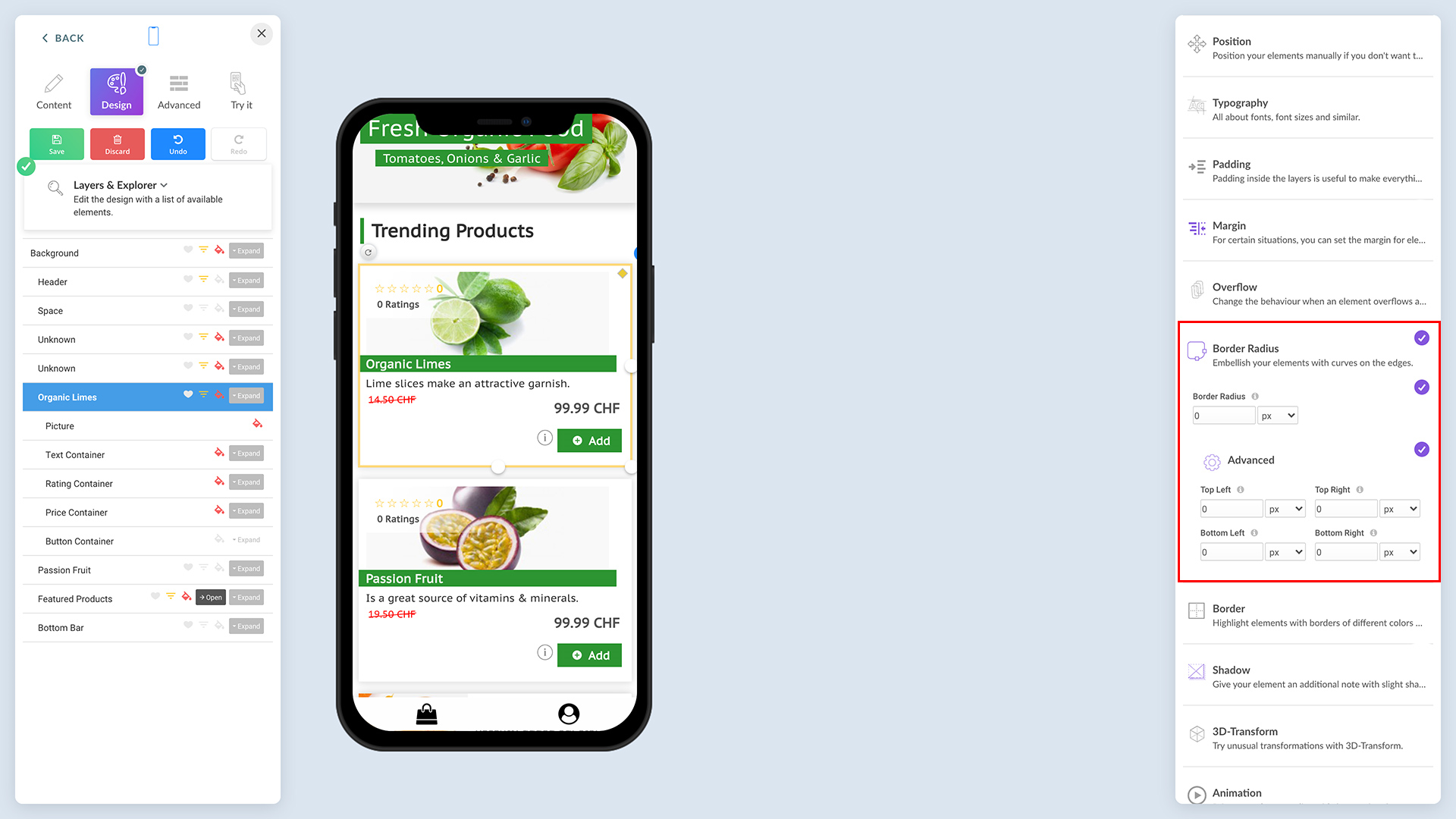
Border Radius: This is the radius of the corners of the object. In the article example, the border-radius of the picture has been set 50% on all sides to make the picture look rounded
23.jpg434.85 KB
Reduce it to 0 (zero) to have sharp edges to look box.
image.png626.62 KB
Border: It adds a border to the object
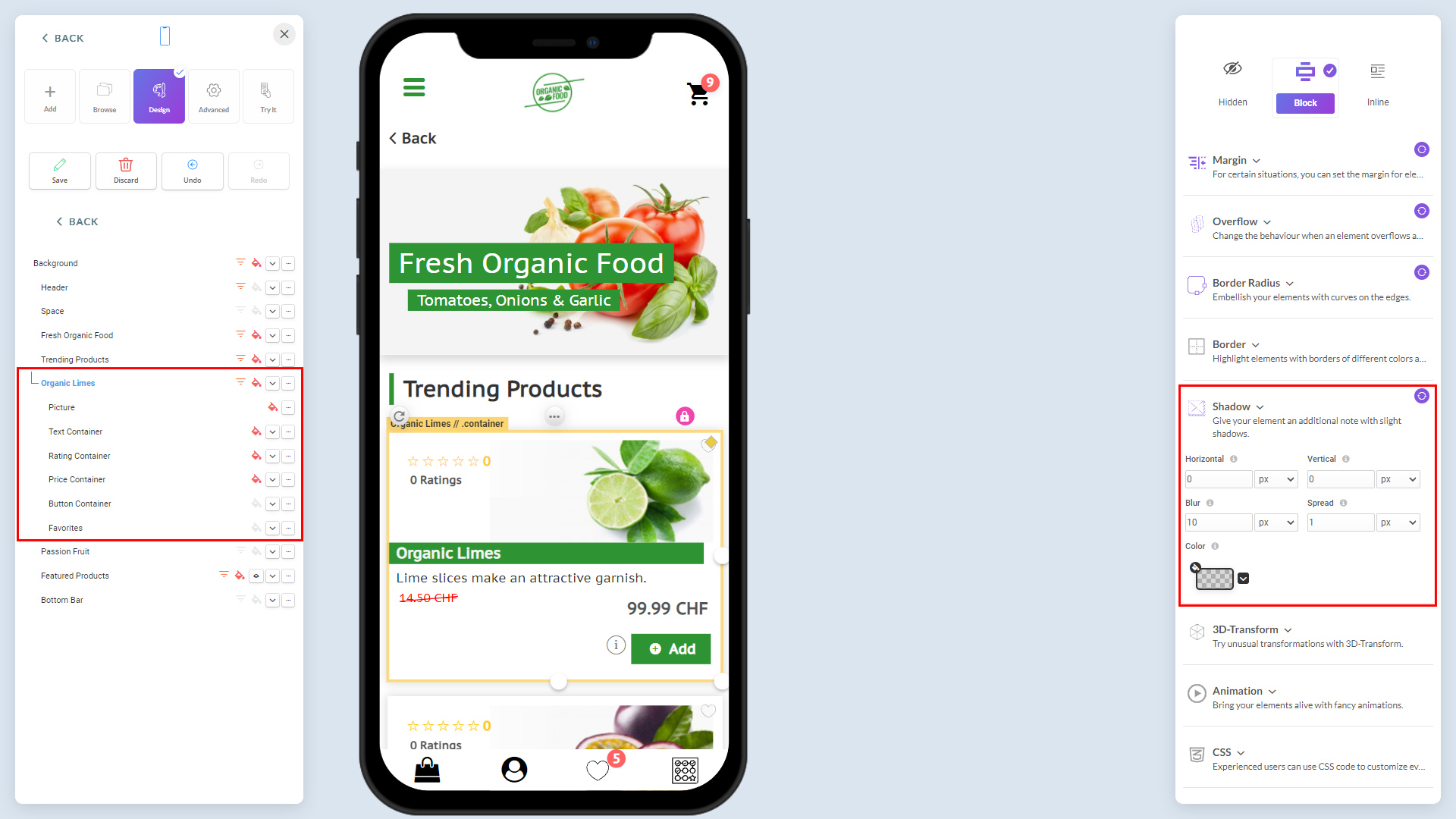
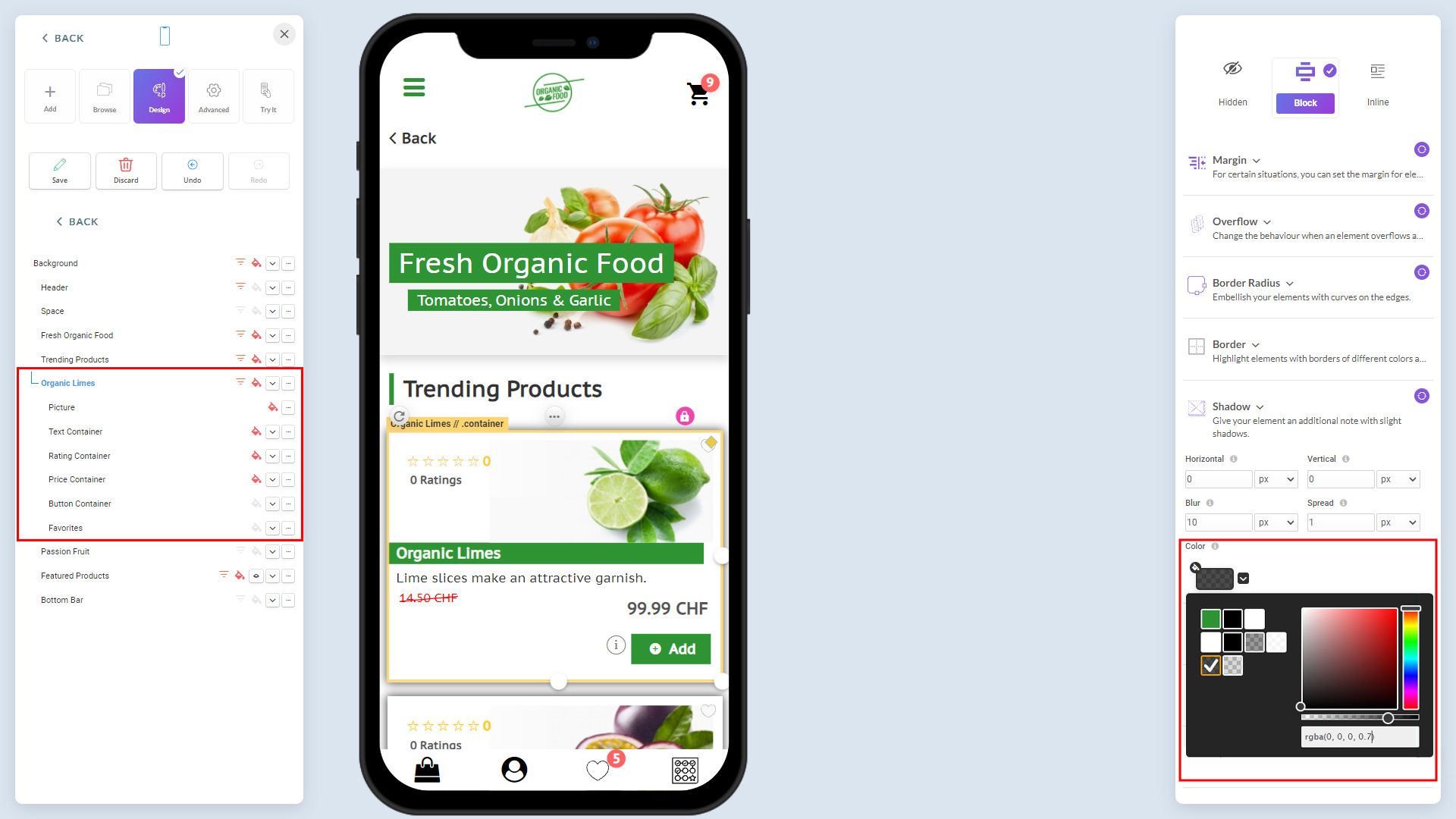
Shadow: Giving a shadow effect to the selected object:
24.jpg434 KB
25.jpg428.94 KB
Upper bar, background, bottom bar
Customize the upper bar
Admin > Design > App Upper bar:
26.jpg364.4 KB
Tabs under Settings
Cart: Customize the shopping cart
Menu: Customize the menu
Tabs under design
Logo: Display/hide the logo
Customize the background
Admin > Design > Colors:
27.jpg260.59 KB
Popups: Customize the app popups
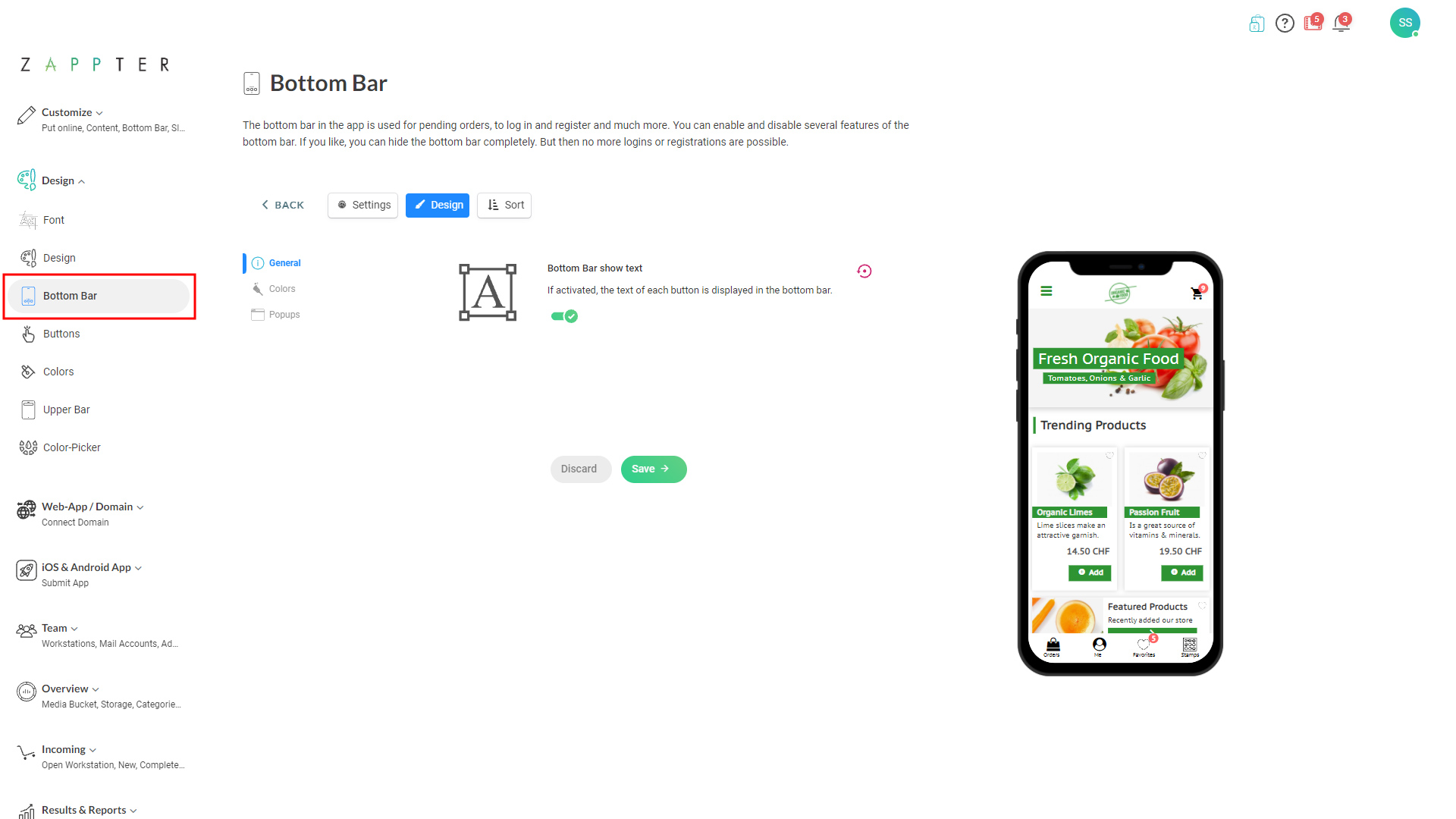
Customize the bottom bar
Admin > Design > Bottom Bar:
28.jpg272.26 KB
Tabs under Settings
General: Display/hide the bar
Login: Customize the text and behavior of login screen
Register: Enable/disable self-registration for users
Forgot password: Customize the background image on forgot password screen
Profile: Customize the profile screen
Home Button: Customize the home button
Orders: Customize the orders icon in the bottom bar
Payments: Enable managing credit cards with the profile
QR-Codes: Enable/disable and customize QR Code option in bottom bar
Chat: Enable/disable and customize the chat behavior
Profile QR-Code: Enable/disable profile QR codes
Tabs under Design
Colors: Set the bottom bar color, and the color for default icon and active icon
Popups: Customize popups colors, and specify if they are modal
Fonts & colors
When customizing the UI, generally, you only set the font size. And, then you select the font and its size in this option. It makes sure the simplicity and the freedom you have whenever you decide to change your font and font color without going through entire customization.
Change app font
These steps guide you through changing your app font with one of the Zappter font families.
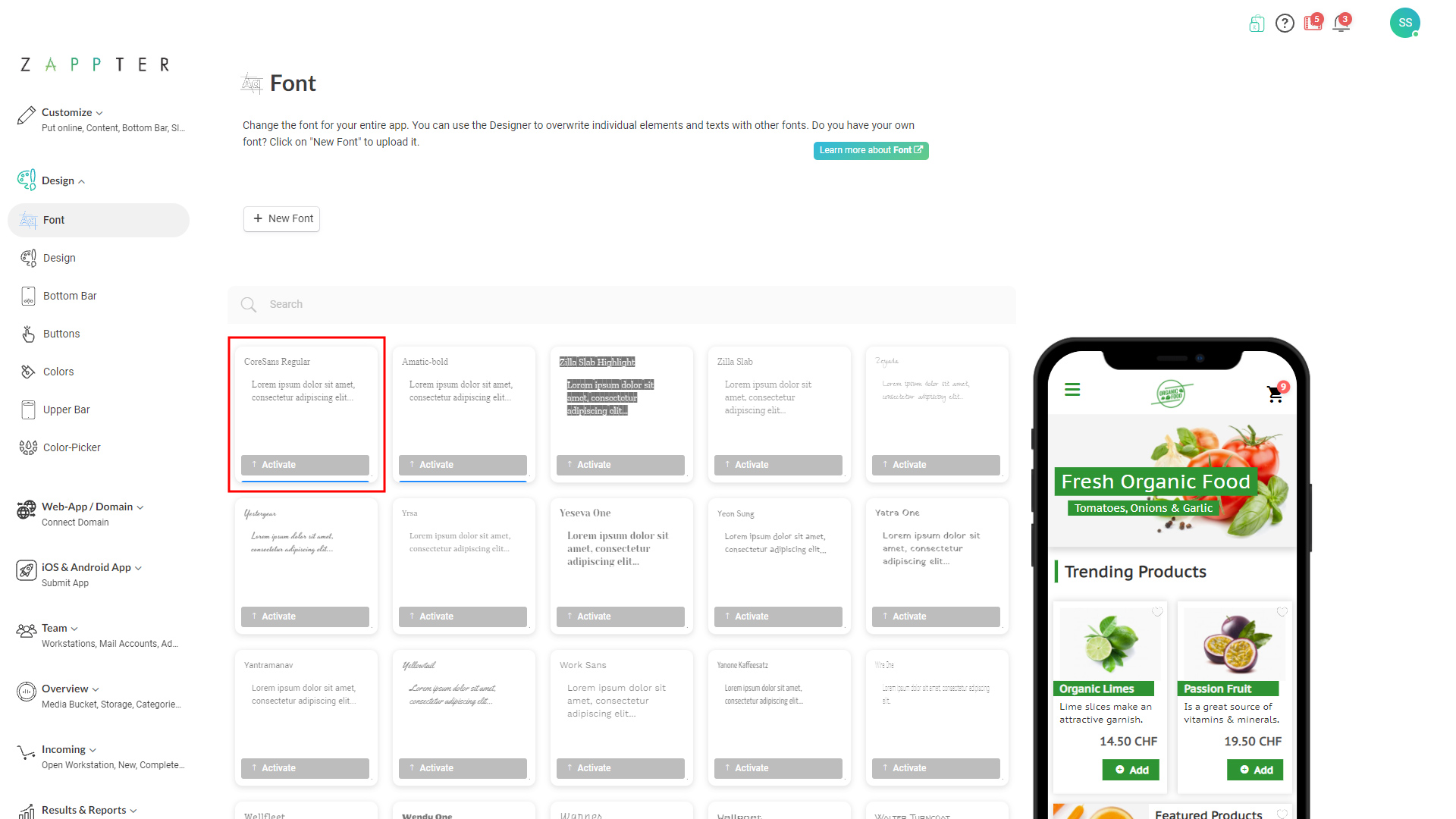
Admin > Design > Font:
29.jpg352.93 KB
Scan through the list of available fonts, and activate it. The simulator on the right, instantly reflects your changes
Add new fonts
Follow the below steps to add a new font family to use in your app. Ideal, if you want to use a font set completely new or your brand-specific.
1. Click on the '+ New Font' button.
30.jpg351.93 KB
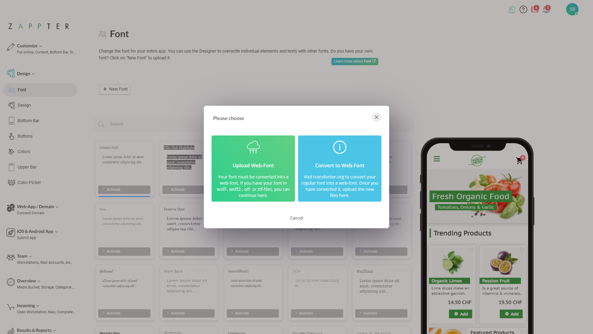
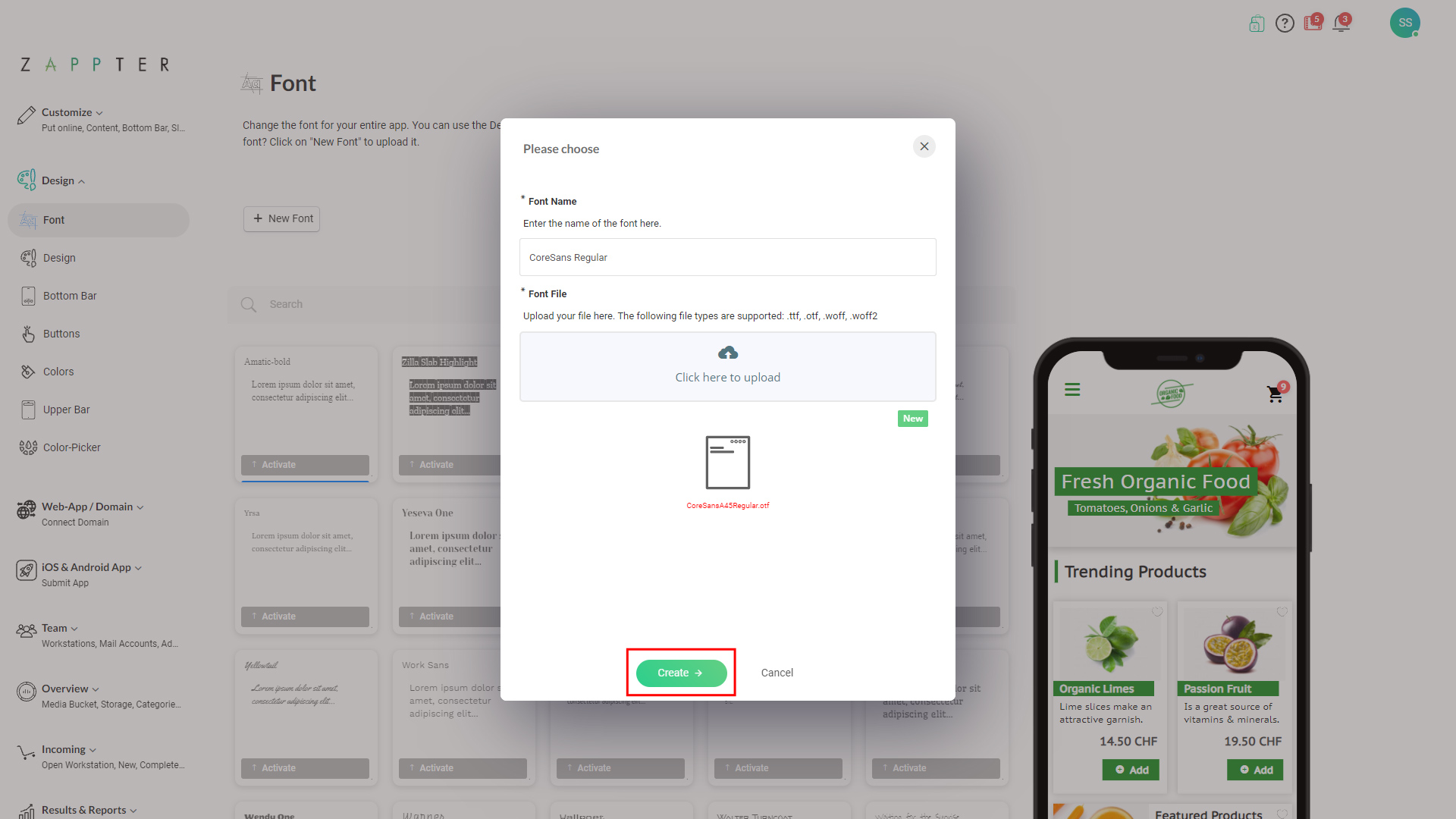
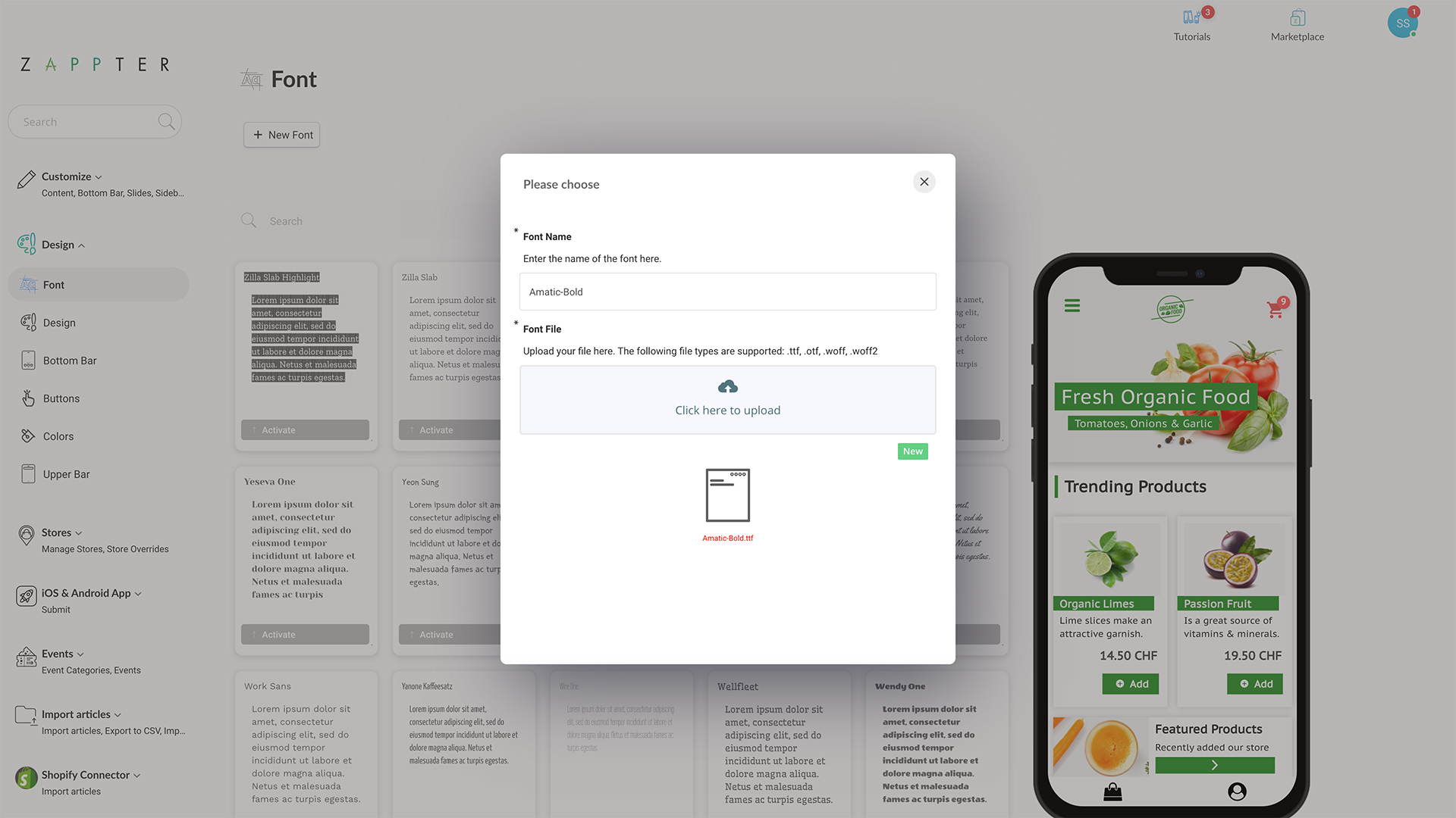
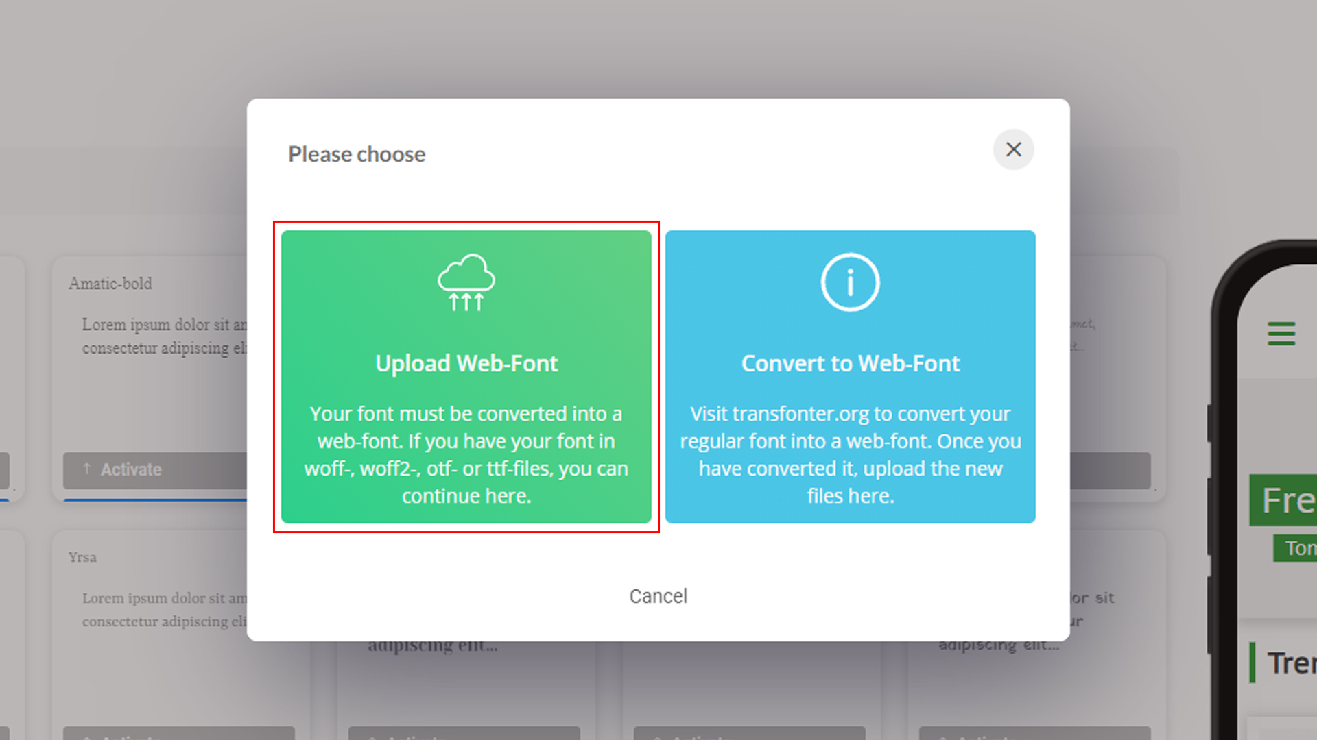
2. Either you can upload a saved web-font or convert the conventional font to a web-font using this option:
31.jpg372.52 KB
Upload Web-Font:
32.jpg325.79 KB
image.png860.3 KB
Newly added Web-Font:
33.jpg352.96 KB
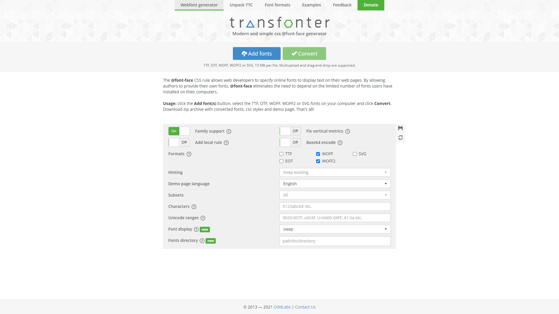
Convert a regular font:
Disclaimer: 'Transfonter.org' is an external source. Below interface and the steps explain may not be the same.
34.jpg322.35 KB
Use the 'Add Fonts' button to add your regular font file
Use the 'Convert' button to convert it to Web-Font, it also downloads the font's zip file
Use the 'Upload Web-Font' option to upload the saved font file


